
Only four days in, but these are my first reactions + the trends I anticipate.

iPhone Who?
The biggest change is just how much less I use my iPhone. I still carry it around of course, but I use it so rarely compared to how obsessively I used to just last week. It’s not only that the Watch can do most things that I used to do on my phone, but I find myself making a point not to use the phone even if in many instances it would be easier. It’s kind of how I used to read books on my iPhone even though my iPad was just in the next room. Reading on the iPad is better, but it was just a little too much effort to get it. Anything involving my phone feels that way now.
I Use The Native iOS Apps More
I use apps like Sunrise, Mailbox, and other similar alternatives to the built-in iOS apps. But the way the native Apple apps integrate with the Watch have caused me to switch back to the basics. For instance, I love having the calendar as a “complication” on my watch face, which only works with the iOS Calendar app.
Same with Maps. Normally I use Google Maps, but Maps on the Watch is awesome. Driving directions are especially cool, because your hand is right on the wheel and it taps you to turn right or left.
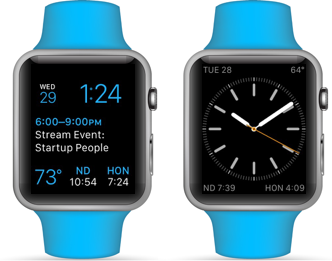
I Do Actually Change Watch Faces
I didn’t think I would, but I really do take advantage of switching it up. During the week I’m all about seeing my upcoming appointments and the world clocks, but on the weekend I went for a traditional watch with no numbers. I don’t need to know that it’s 2:41, and as someone that used to only check the time on my iPhone, it’s a new experience to actually not be that accurate when I don’t need to be.
Email, Or Lack Thereof
One of the shifts I truly did not anticipate is how I use email less. Which is weird, because I used to spend most of my day just emailing, all the time. (now I just have a ton of unread email…) Why? Well for starters, there is no way to write or reply to an email on the Apple Watch using the built-in Mail app.
I do sometimes skim my email on the Watch for important items, but the main purpose of emailing for me is to reply, and since that’s not doable, I just sort of stopped checking. Also, I have notifications turned off for email, and since there is no equivalent of an app badge, I don’t even know when I have new emails unless I take out my phone.
If It Doesn’t Have A Notification, It Doesn’t Exist
As I mentioned above about turning off email notifications, the same goes for other apps that I don’t consider vital. I was already pretty selective on my phone, but I would get the softer nudge by seeing those little red app badges on the home screen. On the Watch, it’s notifications or bust. Unless I specifically open an app to check, I just never would know if it has new content or not. And most apps seem to update much less frequently than on my phone, so I get turned off when I check a news app only to find it’s the same stories from this morning.
Also it’s started to annoy me that notifications don’t sync across devices. So I end up with the same notification on my Watch, iPhone, and iPad, even if I already checked it on one. Although at least if you clear them in one place, they clear in all.
Text Sucks. Photos Suck Too. But I’m OK With It!
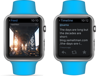
Anything longer than a sentence or two is sort of unbearable. It’s not that it’s illegible, more that I just don’t want to read something long. Visual media definitely is much better, but on the small screen it’s not great either. It’s sort of like the priority has been shifted from depth to speed. I found it frustrating when I couldn’t zoom in on photos in a lot of apps (like Instagram), because they are just displayed so small. But then I came to understand that the detail doesn’t matter here. It’s just about getting a quick communication into your brain, whether it be photo or text, and then moving on to the next one. I’m actually really enjoying sort of “skimming” the Internet, triaging, and then at night I usually comb back on a larger screen to go more in-depth on important things I missed throughout the day.
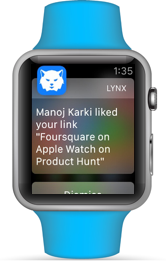
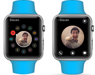
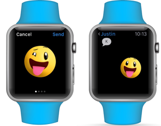
Messages Is The Centerpiece
By far the thing I use the Watch for the most is texting. Which makes sense I guess since that was my most common activity on the iPhone too. I used to text someone and then keep my iPhone out and unlocked just in case they wrote back soon, especially while walking. Now no need! The Watch is always out and always unlocked, perfect for ongoing conversation.
I Don’t Use The Bottom Button
It seems that Apple doesn’t quite understand my above point about Messages. There are hardly any instances where I am starting a conversation fresh with one of my close contacts. I’m always just picking up the thread from where we left off. The exception I suppose is making phone calls, but that is not a very common activity for me, especially since I can’t initiate a call on my phone from the Watch. (but if I could, and if there was a way to start a call from a Messages thread I would totally use that)
The “digital touch” of tapping to someone or sending them drawings or your heartbeat - that all turned out to be totally useless. Everyone that gets the Watch tries that out first, because Apple made such a big deal about it , but it’s total nonsense. The drawings disappear so fast that you can’t make anything cool or anything with multiple colors. Again, if this was part of Messages, then maybe I’d use it more like “reply by drawing your own emoji!” but it’s just too random to use that physical button just to find someone and draw to them.
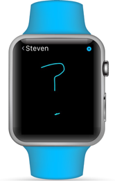
One exception: when my child is old enough to draw, I can imagine that being pretty fun when I’m traveling.
Also: the general concept of being able to use the sense of touch remotely is quite profound. I’m sure at the beginning, talking to someone remotely (the telephone) seemed like a silly novelty. I’m excited to see where the future of this technology goes, but this initial incarnation is just not useful.
I Don’t Want To “Continue On My iPhone”
A lot of the apps are set up assuming you will be jumping between the Watch and your iPhone a bunch, but that is not actually the case. For instance, in the Calendar app, it only displays the current month. So it’s the end of April, and I want to look at the first week of May? Can’t do it, need my phone.
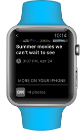
Also a bunch of the third-party apps, especially media or social media ones, only give a few items, and then you need to go to your phone to see more. That is because Apple prescribed that sort of approach to developers. But if I wanted to be using my phone, then I wouldn’t be accessing the feed from my Watch in the first place!
It’s kind of like when I see those QR codes in paper magazines that say, “Scan this to read this article on your phone.” But like, if I was on my phone, why would I also be reading a paper magazine?
I Miss Regular Emoji
These goofy animated ones freak me out. Admittedly, I am using them simply to prove (show off) that I am texting from my Apple Watch. But they don’t have any of the charm or quirkiness that the “real” emoji have. They’re not cool and Japanese and weird and 2D enough.
And why do they send as animated GIFs with black backgrounds to phones? They should have a white background on the phone and black on the Watch (or transparent would fix it).
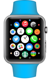
The Home Screen… Looks Pretty, But That’s It
It’s not very utilitarian. Anything outside the center circle is a very small target, so I often launch the wrong app by accident. Yes, I could scroll over and try to center it first, but I’m lazy. Also as far as organization, forget it. Besides the inside circle of my my used apps, I don’t have any sort of system.
The workaround I discovered a while back: use Siri to launch apps. “Launch Messages.” Much better! It’s funny all these features they had on the iPhone that I never used but now I use a lot on the Watch.
Force Touch Would Be Cooler Per Item
The way Force Touch works is that it’s a universal action for the entire screen. So I’ve noticed some third-party apps that use scrollable interfaces have visible buttons under each item in the feed. Some other apps load their feeds left-to-right so that each item is its own view, and that way Force Touch is specific to that item because it’s the only thing in the view.
The problem is that scrolling with the Digital Crown is way better than swiping side-to-side. It would be great if Force Touch could know where on the screen you were touching. It’d be more like a Force Tap, in that it would matter where on the screen your finger was.
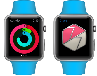
I Think It Will Make Me Healthier-ish
The Activity app is pretty cool. I really like the reminders to stand, and I typically try to meet my daily calorie goal. If I’m debating taking the subway or walking and I’m still not close to my goal, it definitely makes me more likely to walk. The medals are super pointless though. Yesterday I beat my goals for the day, and I was all psyched and then got some nonsense picture of a medal. This is a great example of where Apple just really doesn’t get (or doesn’t want to get) social. If I could send that medal or that cool activity progress graphic to my friends or post it on Twitter or Facebook, that’d be much better. Look what I did! I stood up 12 times! But instead I just get to stare at the medal by myself.
No Sharing
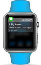
Relatedly, for a device that is supposed to be all about connecting people, they really make it hard to share stuff. I seriously miss the iOS share sheet. It is very frustrating to find great content on the Watch and then not be able to share it. Or take a photo with the Camera Remote, but then you can’t share the photo. I end up going to my phone, finding the thing I want to share, and then sharing it from there. Not cool.
Eating With It
When I lift up my left hand while eating, the watch screen turns on. So it just goes on and off throughout the whole meal which is super distracting.
I Want Predictive Typing
I use dictation a ton, but there are all sorts of times when it’s just not appropriate to speak out loud into my wrist. If they had a keyboard + predictive typing, that would go a long way. Like if I got a text, “When will you be here?” And I could just write back “Ju” and then choose “Just” from a list, “o” and choose “off” and “sub” to “subway”, that would be awesome. It would be slow and cumbersome for sure, but in that moment, I’d much rather do it that way then need to take out my phone.

My Hopes For v2
Honestly, it’s mostly the little stuff. Apple made such an effort towards the customization of the appearance of the Watch, but did not provide nearly as much flexibility of in customizing the software.
When I get a tap for a notification, but can’t check it until 10 sec. later, I want that notification to pop up instead of the watch face. Just let me change the default.
Same with replying to a text — I almost always want to dictate a response, but there is this intermediary screen where I need to choose how to reply, where I choose dictation, and then dictate. Just let me skip that screen. Or even better yet, learn from my habits! Like if a Messages notification came in, and “Reply” went straight to dictate, that would have saved me hours of extra taps over the past year.
There are lots of auto-magic type UX moments that could be improved. Let’s say you are listening to music from your phone in your pocket, controlling it with the Watch, and then a call comes in. You answer it on the Watch. But the audio of the call doesn’t come through your headphones, it comes out of the Watch speaker. (you can select to answer on iPhone, but it seems like that should be the default since it knows your headphones are in and that music is playing)
Or how when you’re on a call on your phone, you can’t mute the call from your Watch. And so on.
These are all nitpicky things I’m talking about that would allow for tiny speed and efficiency increases, and most will probably be solved by software updates.
The one main thing I hope for is that Apple realizes that I want this to be my only device in most instances. It seems like v1 was trying to make it clear that the iPhone isn’t going way, but as a user, I want it to go away.
Maybe Apple underestimated how attached people would become, or maybe it’s all part of their master plan for when the Watch can connect to the Internet directly. Either way, I can’t wait to see what comes next.