
Like all iOS updates, iOS 10 is an improvement over its predecessor in many ways, and in some ways quite significantly (iMessage Apps will get its own post). But this release also comes with some questionable changes and scattered inconsistencies that deserve a closer look. Here are four areas that have been bugging me:
1. Lock Screen
Let’s start with the thing that you’re going to see a million times a day, every day: unlocking your phone. After nine versions of iOS, “slide to unlock” is no more. Now we have:
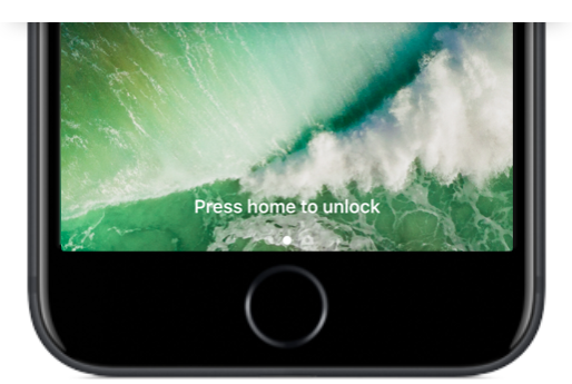
The unlock in the old “slide to unlock” actually meant “open your phone” i.e. go to the Home Screen. If you had a passcode, then you were hit with a passcode screen along the way. With the introduction of Touch ID, you could skip that screen and go straight to the Home Screen using your fingerprint. That all happened so fast that I barely saw my lock screen any more.
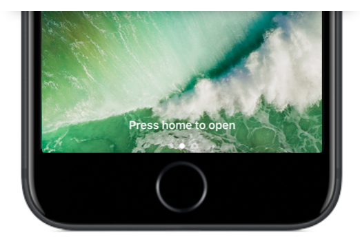
Now unlocking and opening have been decoupled where “unlock” means Touch ID and “open” means go to the Home Screen. You must first unlock*, and then open. The reason, perhaps, is that Apple wants you to actually use the Lock Screen. When you do swipe on the Lock Screen, it brings you here:
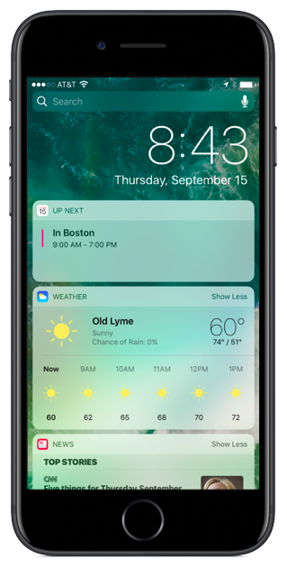
If we are supposed to use these widgets, why require a swipe to see them? Why not just make the above screen the one and only Lock Screen? Like complications on Apple Watch, having these widgets available at glance, especially now that you can raise to wake, would be incredibly useful.
For those who miss the speediness of unlocking with iOS 9, don’t worry, there is a deeply buried setting just for you:
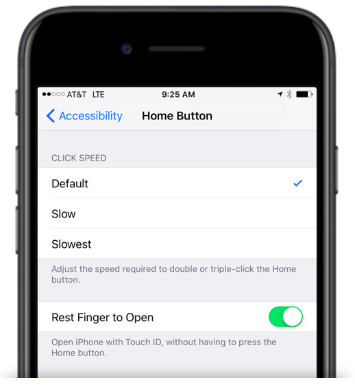
Personally, I’m going to try it Apple’s way for a while and see how it goes, but I like knowing that setting is there if I need it.
*Re: “press to unlock” — Why prompt for a proper press when all that is actually required is to rest your finger on the home button? Touch ID is a term used elsewhere in iOS, so why not prompt “Use Touch ID to unlock”?
2. Notifications: More Pressing
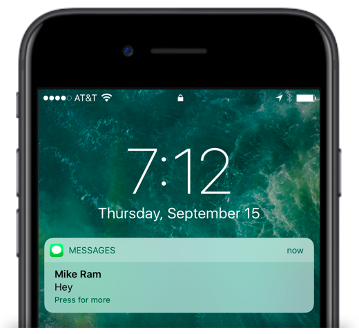
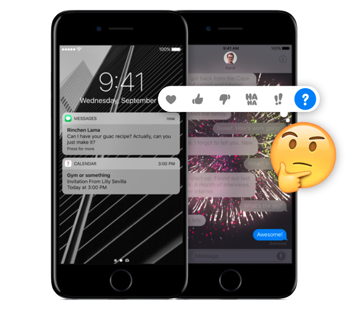
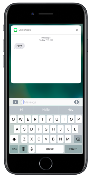
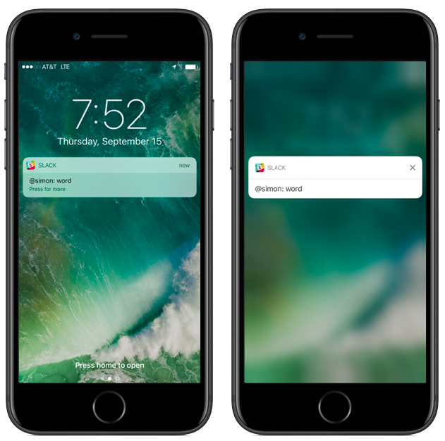
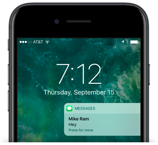
Previously the prompt on notifications read “slide to view”. Now it’s “Press for more” — again, press instead of slide. Pressing here means using 3D Touch, and when I press on a notification, I am brought to the expanded detail view. For Messages, this is pretty cool:
For apps that don’t have an expanded view, it’s not that cool:
Now what if I actually want to go into the app itself? You can tap on the expanded view after pressing, but you cannot tap on the original notification directly from the lock screen. If you do try to tap it, nothing happens. No feedback, no nothing.
Imagine you are a novice, or even just a normal iPhone user. It says press. You tap. Because being told to press the screen sure seems a lot like tapping the screen, and tapping things is usually how you open them. Nothing happens. You tap again. Nothing happens. “But it says press, and I’m pressing!” Hopefully in your frustration you “tap harder” and discover 3D Touch. But you just wanted to open the app!
Turns out you can still “slide” a notification on the lock screen, although it took me days to figure that out since even I took the “Press for more” prompt at face value and didn’t even attempt to swipe.
However, this all works differently in Notification Center. Unlike the Lock Screen, sliding a push in Notification Center does not open the app, and a normal tap does open the app. And while press works the same, there is no prompt:
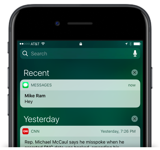
From a UX perspective, I actually think the Notification Center version is superior. Without a prompt, the user will naturally attempt to tap to open as it is the most common gesture to open something, and it will work as expected. Then the user can choose to use the more advanced press gesture to access the enhanced view (consistent with other uses of 3D Touch), and it will also work as expected.
The most frustrating thing about the Lock Screen experience is that the tap gesture is not being used for anything else either. The most common, discoverable, and easiest gesture is just completely non-functional.
The elephant in the room here is that Apple is purposefully emphasizing the enhanced notifications over opening the actual app. And so while this might be frustrating today, it is presumably going to force (no pun intended, I swear!) developers to bring more functionality out of their apps and into areas like notifications, furthering the trend of distributing a given app’s functionality throughout the OS instead of making the user launch the app itself.
3. Control Center
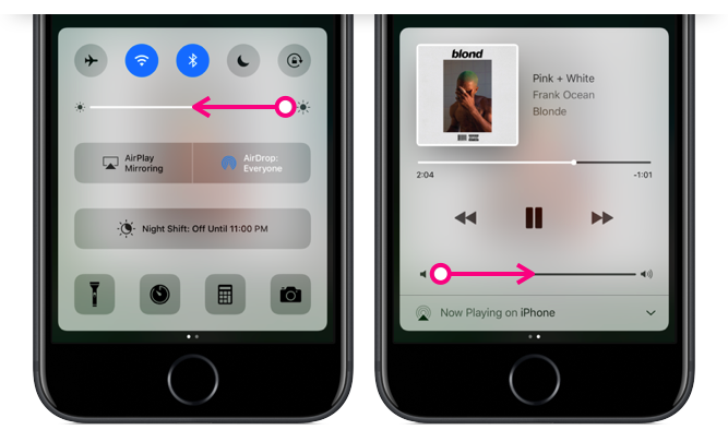
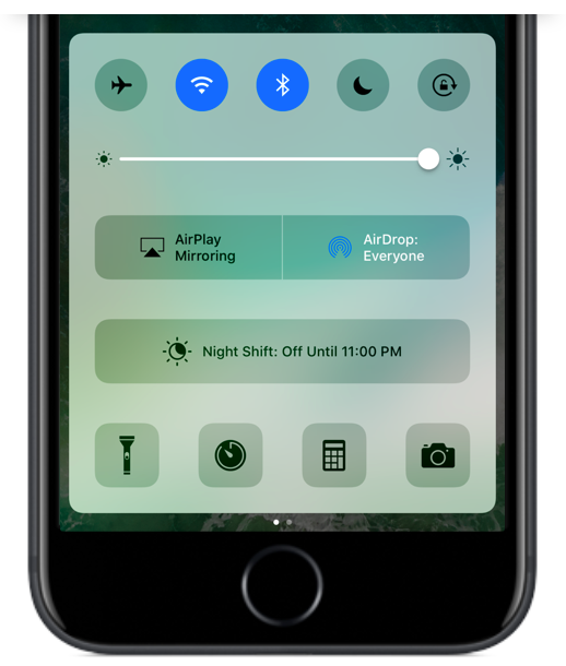
The most obvious change to Control Center is that it is now two panels instead of one. The first has the bulk of the controls, and the second is used exclusively for audio controls.
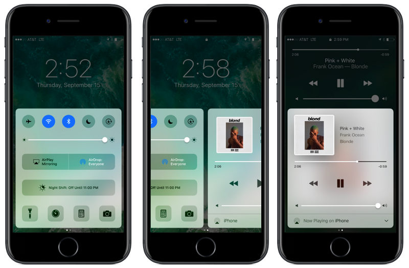
On the main panel, the buttons along the top are now color-coded buttons to better indicate whether they are toggled on or off (to please the same people that hated the shift key), although Apple uses four different colors across the five icons. Other than being the same colors used in the Settings app, they are arbitrary and mis-matchy.
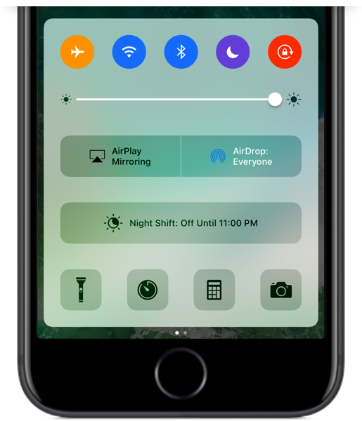
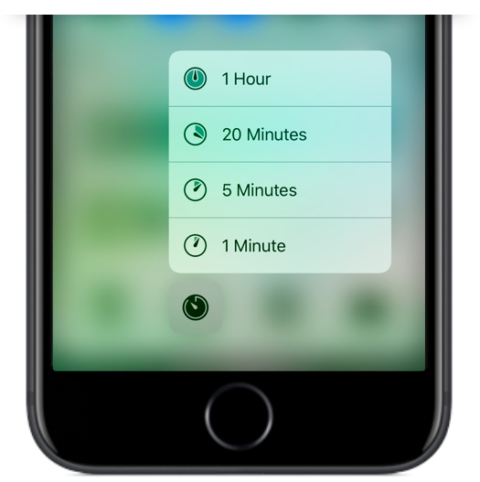
3D Touch support has been added to the four icons along the bottom, allowing you to use Quick Actions, but I wish they had added similar functionality to all the controls, particularly Wifi and Bluetooth. My longstanding dream has been to have instant access to the Settings app from Control Center. (Gotta dream big kids!)
Throughout iOS, it is unclear when 3D Touch will work and when it won’t, and that sort of ambiguous user expectation makes it a lot harder to deliver a consistently great UX. One solution would be to add some sort of visual indicator (like the Live Photos indicator), and another possible solution would be to add a 3D Touch state to everything. I don’t see much of a downside in the latter.
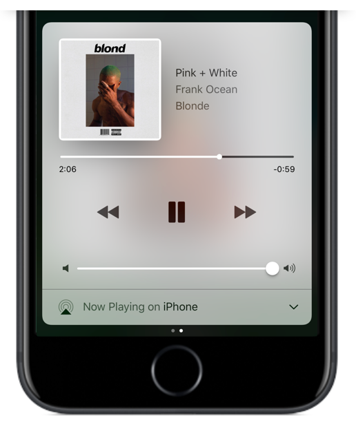
As for audio controls, it’s only when you find yourself listening to a song or podcast that you realize something important is missing from that first panel… where is my beloved skip 15 sec. ahead button??
For someone like me who is constantly pausing, playing, rewinding and skipping, since its introduction in iOS 7 I have loved popping open Control Center and having quick thumb access to audio controls. Now, 50% of the time when I pull it up, I’m on the wrong panel and need to swipe over before I can hit pause. Likewise, when I want to use one of the main controls like toggling on/off Wifi, I swipe up to find myself on the audio panel instead. These extra swipes make for more friction and slower results.
It pulls up whatever panel was used last, meaning that even if there is no audio playing, it might default to the audio panel. It would be much more useful if it was contextual, for instance assuming that I don’t need the audio controls since there is no audio playing.
I’ve also had many mistaken swipes while trying to adjust the brightness or volume due to the small target size of the slider buttons. I often swipe to the other panel by accident instead of turning the brightness down or the volume up.
From what I can tell, there is nothing gained to the user by splitting Control Center into two panels, and we know there are no space constraints since iOS 9 managed to fit all the same controls into one unified panel.
The area on the first panel once used for audio controls now contains a giant Night Shift toggle button. This had previously been a fifth button along the bottom row, but now it gets the biggest slab of real estate in all of Control Center, and it is merely an on/off switch for a feature that is mostly useful because it automatically toggles on/off. You can’t even adjust the Night Shift settings from here nor is there a way to get to those settings — an example of where more 3D Touch Quick Actions would have been useful.
On the topic of large, non-contextual buttons in Control Center — why do we need the AirPlay Mirroring on/off toggle and AirDrop Settings here, visible all the time? The AirDrop settings should be in the Settings app with all the other, you know, settings. And AirPlay should only be an option if the device detects an AirPlay compatible device.
As for visual continuity, Control Center is now a bubble that you can drag vertically almost anywhere on the screen (which is fun), but being untethered means it no longer matches Notification Center, which is still anchored to the top of the screen. I enjoyed the previous symmetry here, as the only two panels accessible anywhere you are, at any time. Now they seem like two disjointed features.
4. Widgets and Search
While widgets* existed in previous versions of iOS in the Today View, iOS 10 widgets can be much more dynamic and are available in more places.
*Widgets originated with Dashboard back in Mac OS X 10.4 Tiger! I may or may not have been at the midnight release party at my local mall in 2005…
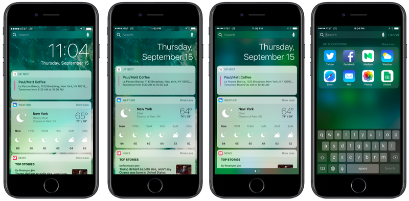
It seems no matter where I swipe, there they are again! Generally, other parts of the OS have a distinct place where they live. Repeating a whole section of iOS in three different places seems against typical Apple design conventions.
But if the goal is ubiquity, I find it odd that widgets have been omitted from one place I go quite often, and the easiest place to reach from any Home Screen pane: pull down for search. If Apple is being liberal with accessing widgets, why not put them here too?
The Long and Winding Road
iOS 10 has some quirks for sure, and like all Apple mysteries, it is unclear if these are merely oversights or clues to some overarching trend that we can try to uncover. Emphasis on press. Emphasis on widgets. (although you can’t press a widget…) Emphasis on expanded notifications. Apple is leading us down a road where opening apps matters less and pressing the screen matters more. Can they get us there without adding complexity, confusion, and inconsistency? We shall see.